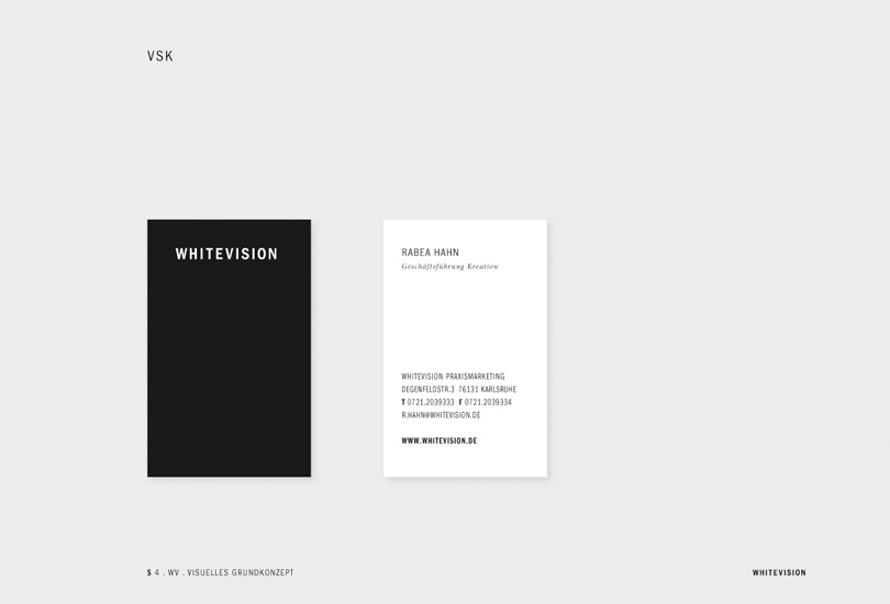
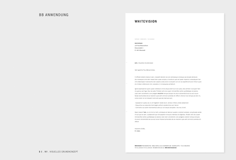
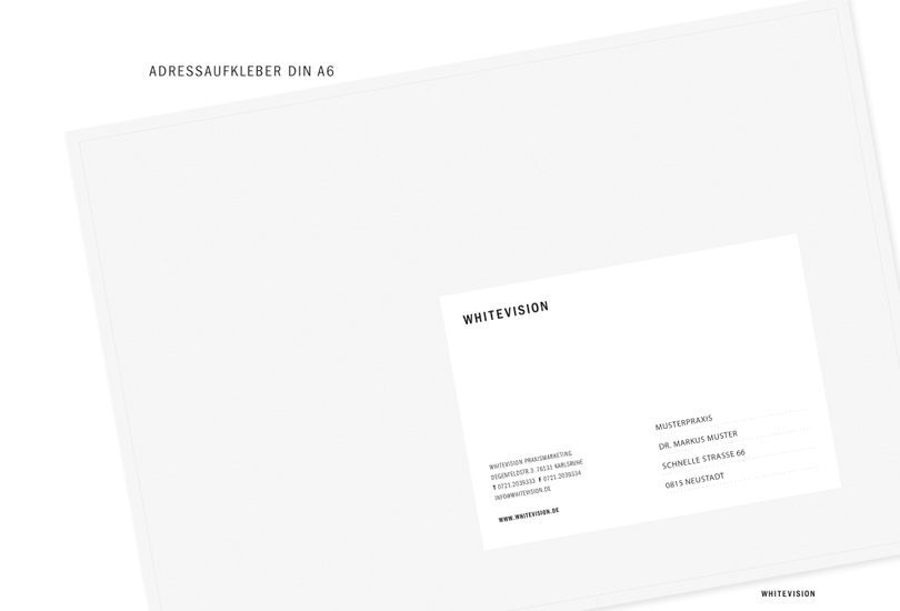
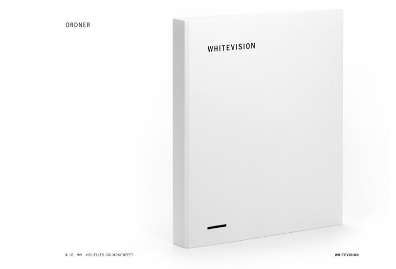
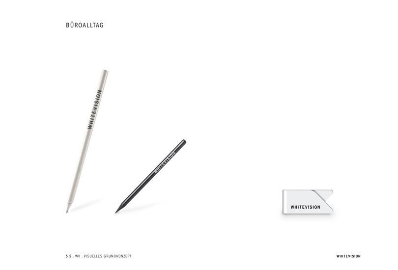
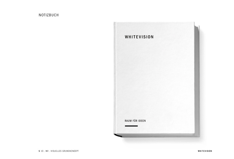
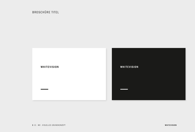
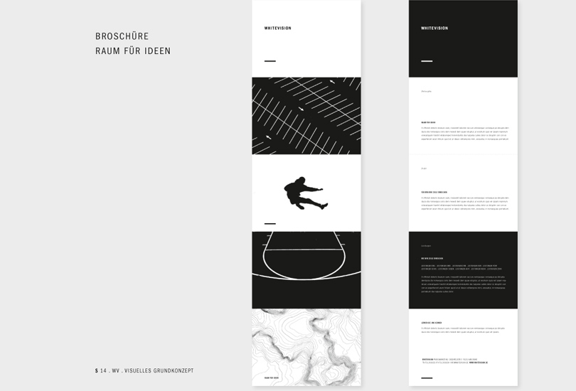
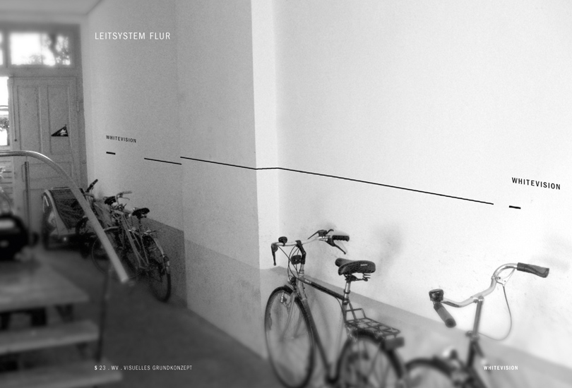
Basic visual concept for Whitevision Corporate Branding. The challenge: to create a visual identity for a corporate design agency whose principal business is in the health care market. Formal Solution: the approach was to form a visual frame underlining one of the main purposes in the work of the agency, to create a stage for the client and his product. Reduction of the color scheme to just black and white serves for elegant restraint and accentuation of the contents. The typography supports the overall reduced and focused style of the outer appearance.
Role: Concept, Art Direction and design. Visit Whitevision here.


